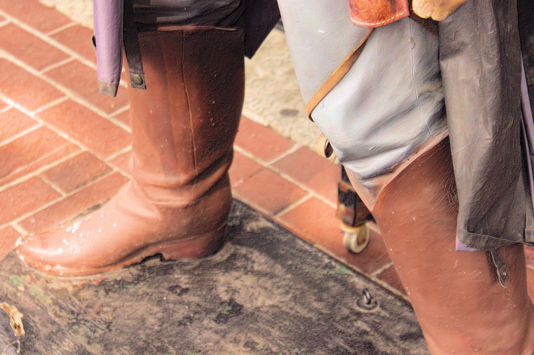
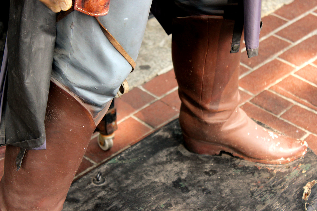
Finding a favorite photograph from your own gallery is harder than it sounds. I liked so many photos I have taken so many nice photos over the semester. The picture of the cowboy boots stood out the most for me. The angle of the picture is intriguing to me but when I flipped the photo I liked it so much more, you can see the full boot before the leg makes the photo look so much better. adding more color to the makes it look more lively. I am happy on how the photo turned out.
the flower bud is not the the middle to make the picture more interesting. I like the different colors of green and how in focas the flower bud is.
When I was learning to take pictures of depth it wasn't as easy as i thought it would be, but once you pay attention it is really fun to take pictures in depth.
BootsThe angle is my favorite part, In stead of taking a picture of the whole cowboy I choose to only take a picture of his boots. gASSY jACk gAOLER'S mEWS The theme in this picture is sort of rustic to me, In a way the window frames the corner of the picture which I think is cool. The bricks aren't perfect and more realistic. I made the picture black and white to make more pleasing to the eyes. hOT AND sTEAMY The gold stands out in this picture and i like that about it. I would change how the picture in on an angle and get a little more of the clock. nEW VS oLD I believe this is a perfect of Old vs New. The new fresh flowers are bright and have nice colors. The lights have dust and are a bit rusty showing the old. TOURIST The bus of tourist reminds me of leading lines before turning. The editing I did was cool and new for me, the bus stands out the most which i like. I would change the difference from the background to the bus. LightMy favorite part of the picture is the angle of the lines and how much the sun is taking up the picture. The picture of light is simple and sweet. The beams frame the sunlight. PlanesPlanes can mean the flying transportation or even a flat surface. The brick wall is flat like a plane. I like the color of the bricks and the rusty tube. I wish i showed more how flat the surface is. trounce ally The picture I took is simplicity of the poster. I like the black brick wall but the shadows are too dark for me. wWater street is the picture of W I felt that it is a popular street in gasstown. The picture is not my favorite but i do like the brick wall. as the background.
The flower is simple and beautiful, the drops of water gives the flower a topping like a cherry on a Sunday. I wish I let the flower have more color, having the picture grey is still nice to my eyes. Giving the flower color would be a risk for me because it isn't my favorite on pictures. I had fun taking different pictures of classmates modeling, I chose this picture because of the simple background.
The model is looking away and not looking straight into the camera which I feel makes this picture look stronger. This picture I took was really hard to take and get how I wanted it, but I learned alot from this one picture, that it is okay not to get the first picture perfect and to let go and play with the settings. I like how the small flower is viable but I wish i got the picture on even sides.
This picture is a classic example of leading lines. I like how I captured the clear wood in the front and it blurs out to the back. I like the blue with the smooth water and tiny sprinkles of water.
I love this picture of the valve and how the red takes over the picture it captures my attention. I like how you can see the clear rusty handle and the rest of the picture is blurred.
The other day my class and I went for a walk near our school. I looked over the side and saw bright yellow flowers with a perfect back ground of grey rocks. this picture makes me feel good inside, hope it makes you feel good too.
I have never Knew about exposure values before we did this project in class, I enjoyed seeing the difference from dark places to light and light places to dark. I would use these skills on my own or for different projects for the future. When I uploaded my pictures to the computer and looked back I noticed how intense the EV 2- or the EV 2+ setting was to the picture, personally I like EV 2+ better than the darker scale. All though Using EV- against windows you could see more of the details in the picture. While we were doing we learned more how to use photo editing software which I enjoyed even though It took A bit to catch on. I hope we can do more things like this in the future.
|